Refashioned bits and bytes – the new TB.One UI
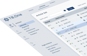
On September 8th the time has come. We will proudly present the new design of TB.One. With the new design we not only offer you a completely new, modern look & feel, but also enable you to work more efficiently and comfortably.

On September 8th the time has come. We will proudly present the new design of TB.One. With the new design we not only offer you a completely new, modern look & feel, but also enable you to work more efficiently and comfortably. We have spoken to Luka Marinkovic, Product Owner at Tradebyte and responsible for the redesign. In the interview he already reveals some changes and gives insights into the redesign project.
Tradebyte: Why a new design for TB.One? How did you make sure to satisfy the needs of our users?

Luka: TB.One has been on the market for over 11 years now and has hardly changed optically since then. Therefore it was of course time to bring the design to a modern, up-to-date level. But the UI relaunch serves several purposes. On the one hand, a fresh, trend-oriented UI design strengthens our product position and our brand image. On the other hand, we want to make the work of TB.One users more comfortable and efficient. Last but not least, a new product design forms the basis for future strategic development and improvement.
When creating the new design we chose a very agile working mode. This means that we have been in a constant feedback loop with customers and internal teams since the beginning of the project. This loop will continue until the final rollout and beyond. Only this way can we meet the needs of all TB.One users to their full satisfaction. We’re establishing a new feedback culture that puts an accent on permanent interactions between our product teams and customers. Our goal is to have agile iterations with our users. We attach great importance to their opinions, which can help us to shape the product to meet their expectations.
Can you give us some insights into the new design?
At first sight most users will probably notice the visual change. Here we have worked according to the motto »Less is more!« TB.One is full of important data and content, but this should not be reflected in the design. The new visual language implies the principle of modern minimalism and is reflected in all elements and components. The entire navigation layout has been redesigned. The font is now bigger and more modern and also the outdated icons shine in a new style. All unnecessary boxes, lines, shadows etc. have been removed. So users can now concentrate on the essential functions and content.
What do users have to consider when switching to the new design?
The rollout of the new UI is free and automatic, which means there is no to-do for users. We are aware that it is not possible to get used to a new design overnight. Especially not if you have been working with TB.One for a long time. Therefore, the old design will be available for a limited time. We would like to see our customers using the new UI from day one, but on the other hand, we’re aware that it takes a particular time to get used to it. In case users stumble upon any confusion or maybe some issue or bug, they can always switch to the classic UI and continue working there.
The rollout of the new design is only the first step. What are your plans for the future?
The UI redesign is of course not finished with the first rollout, it is an ongoing process. It is especially important for us to communicate to all TB.One users that we are open to any feedback. We want to work transparently and in close exchange with users to achieve the best possible result. I can’t reveal anything about our future projects at the moment, but TB.One will continue to develop (not only visually) and all new features will be launched in the new look.
Find more information about the UI redesign in the FAQ or just contact your Success Manager. And don’t forget to register for one of the free webinars.
